THE FOLK OF DOONEY HOLLOW #2 (IGNITION PRESS)
Mabel saves Kerri from the Butcher and brings her to Dooney Hollow. However, the townsfolk of Dooney Hollow aren’t exactly excited about having an outsider in their hidden village. Thankfully for Kerri, Eld Rowan speaks up and speaks in favor of giving her safe passage and a place to stay for at least the night. But will the other townsfolk listen to the first among the Eld or will something more sinister play out in Dooney Hollow?
The Folk of Dooney Hollow #2 - Written By Jeremy Haun – Art By Alex Lins – Colors By Trish Mulvihill - Letters By Andworld Design – Edited By Jamie S. Rich - Published By Ignition Press
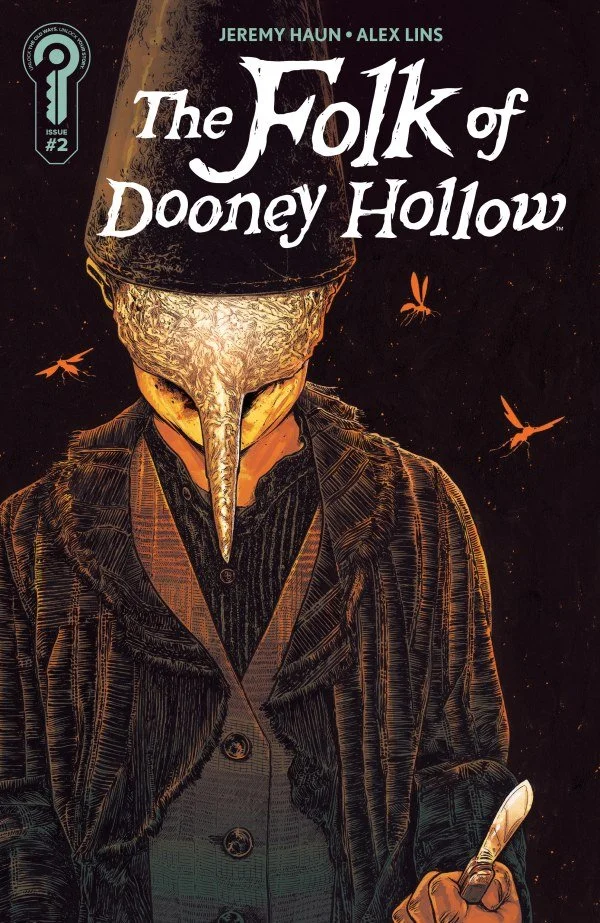
Credit: Ignition Press
*** POSSIBLE SPOILER WARNING ***
WRITING:
This issue takes a step back from the high energy and mystery of the first issue, in favor of a slower paced explanation of where we find ourselves. Jeremy Haun takes the time to introduce the reader to the sleepy village of Dooney Hollow. Revealing some of what this place truly is, well also noticeably holding a lot back to be discovered. The scene with the Elders and townsfolk debating on Kerri being there is telling while being unsettling at the same time. Haun makes the reader feel uneasy throughout this issue which makes the book much more eerie and intriguing. The reveal of the Butcher and how he is mystically kept out of Dooney Hollow adds another layer to be revealed as we get further into the story. If the story in the first issue drew you into this series, the story in this second issue will definitely keep your interest piqued.
ARTWORK:
The artwork truly brings this strange world to life and helps keep the uneasy tone of the story. Alex Lins does an amazing job of bringing Dooney Hollow to life. It feels like the village has been lost in time and is completely out of place in modern society. This helps make Kerri feel even more like an outsider. The character designs of the townsfolk make them look like they are from the puritan era, which further drives home that this place is completely different from modern society. Lins tops the creepiness of the Butcher design with the design of the Fool, which is really saying something. The artwork drives home the uneasy and unsettling feel that the story is going for.
Trish Mulvihill’s color choices complement the linework impeccably. The use of earth tones and darker colors give the town the feel of a place that time forgot. This makes the reader notice just how out of place Dooney Hollow is. The lettering by Andworld Design is clear and easy to follow, as well as fits right into the artwork and never becomes distracting. Together the art team is putting together something really awesome here that deserves to be enjoyed by every reader.
Check Out MY REVIEW OF THE FOLK OF DOONEY HOLLOW #1
Final Thoughts:
The Folk of Dooney Hollow #2 trades the first issue’s frantic momentum for a slower, more atmospheric journey into the strange village at the heart of the story. Jeremy Haun deepens the mystery without giving too much away, while the art team makes Dooney Hollow feel eerie, isolated, and dangerously out of time. With unsettling new characters, mounting tension among the townsfolk, and the threat of the Butcher still looming, this issue proves the series has plenty of secrets left to uncover. If the debut pulled you in, this issue gives you every reason to add the series to your Pull List if it’s not already there.
FINAL GRADE: 8.8/10
Let me know your thoughts on The Folk of Dooney Hollow #2 in the comments below. Thanks for reading!