TALES OF WONDER #1 (SKYBOUND ENTERTAINMENT/IMAGE COMICS)
What if our favorite comic book superheroes weren’t created but yet really existed? Stu & Jake created America’s Freedom Force a long time ago. Since then, due to movies and conventions, Wonder Studios has blown up and sits on top of the world, even if the long-time friends haven’t been friends in a long time. However, the truth about where the idea for the AFF came from is about to rear its ugly head again.
Tales of Wonder #1 – Written & Art By Steve Skroce – Colors By Ian Herring – Letters By Pat Brosseau - Published By Skybound Entertainment/Image Comics
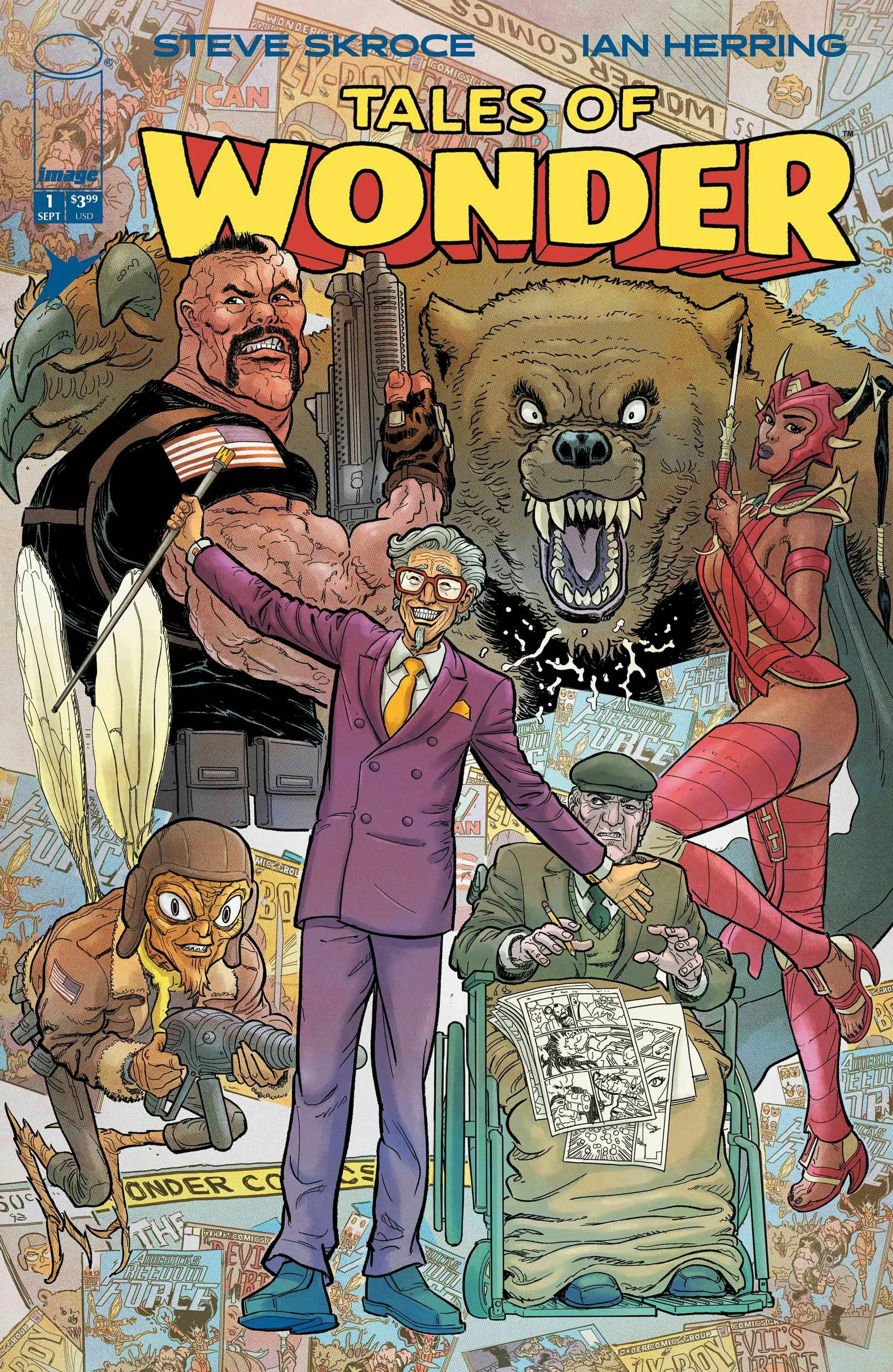
Credit: Skybound Entertainment/Image Comics
*** POSSIBLE SPOILER WARNING ***
STORY OVERVIEW:
Jake sits backstage at the huge convention in San Diego as his former friend and co-creator of one of the biggest superhero comics of all time, America’s Freedom Force takes the stage. Stu Reede is a showman and milks the adoration out of the fans. Due to their small comic book becoming not just big in the comics realm but also spawning blockbuster movies the fame has been good. But Jake and Stu started out as classmates, friends, and even went to the war together all those years ago, even before they created AFF. However, they also had a falling out and did not see eye to eye. But after Jake’s wife died and his health continued to fade, extending the olive branch for the sake of some money was the smart choice. However, neither Jake nor Stu would ever guess how this day was going to end.
WRITING:
This first issue gives readers a lot of story information, but it does not feel like empty exposition. Steve Skroce uses the opening issue to carefully lay out the history between Jake, Stu, and America’s Freedom Force while also showing how enormous that creation has become. Right away, the reader understands that AFF is not just a comic book inside this world. It is a pop-culture empire with movies, conventions, merchandising, corporate pressure, and a fanbase that treats it like mythology. That makes the issue feel bigger than a simple superhero story because Skroce is not only introducing characters and plot points; he is building an entire industry around them.
One of the strongest parts of the writing is how familiar everything feels without becoming lazy or obvious. The San Diego convention setting is clearly meant to remind readers of SDCC, America’s Freedom Force echoes The Avengers, and Wonder Studios functions like a stand-in for Marvel Studios. Those comparisons help the reader instantly understand the scale of the world. Skroce uses recognizable real-world parallels as a shortcut, but then he twists them into something more personal and suspicious. The issue feels like it is commenting on the modern superhero machine, where nostalgia, fandom, celebrity, and corporate profit all blend together until the original creators can become almost secondary to the brand they helped build.
Jake and Stu’s relationship gives that industry commentary a more emotional edge. They are not presented as simple enemies, and that makes their conflict more interesting. There is a long history between them that includes friendship, creative partnership, war, success, resentment, and betrayal. Jake’s presence at the convention is especially effective because he is not there out of excitement or pride. He is there because life has worn him down, his wife is gone, his health is failing, and he needs money. That detail makes the glitzy convention backdrop feel colder. While fans are spending huge amounts of money for access and executives are watching the profits roll in, one of the men connected to the foundation of this empire is struggling just to get by.
Skroce also does a good job making the issue feel like it is about more than one kind of exploitation. The fans are being sold an experience that is expensive and carefully controlled. The executives speak the language of appreciation while clearly seeing everyone as revenue. At the same time, the creators themselves are trapped inside a system that has made their ideas incredibly valuable without necessarily protecting the people who created them. The issue points toward questions of ownership, credit, and legacy, especially when one creator becomes the public face of success while the other is pushed to the edges. That gives the story a bitterness that feels grounded, even before the superhero elements fully reveal themselves.
What makes the ending work so well is that Skroce spends most of the issue making the reader believe they understand what kind of story this is. For a while, it reads like a sharp, slightly cynical look at comics culture, corporate entertainment, and the damaged friendship behind a famous creation. Then the reveal changes the entire shape of the book. America’s Freedom Force is not simply an idea Jake and Stu came up with; it is connected to something real from their past. When the heroes return to save them from a monster, the issue suddenly becomes much stranger, bigger, and more exciting. The twist does not feel random because the issue has already been building mystery around the source of AFF, but it still lands with the shock of a story kicking down a door.
By the end, the writing succeeds because it turns what could have been a simple superhero homage into a layered first issue. Skroce gives readers a recognizable world, fills it with believable industry criticism, grounds it in the messy relationship between two aging creators, and then uses the final pages to reveal that the truth behind the legend is far more dangerous than anyone expected. It is a smart structure for a debut issue because the backstory feels meaningful instead of slow, and the final reveal makes the reader reconsider everything that came before it. The result is an issue that starts as a commentary on superhero culture and ends as the beginning of a much larger adventure.
ARTWORK:
The artwork in this first issue is one of the biggest reasons the world feels so immediate and believable. Steve Skroce draws the convention setting with the kind of scale and visual clutter that makes it feel real. The crowds, stage lights, banners, booths, and backstage areas all help sell the idea that America’s Freedom Force has become a massive cultural machine. The setting never feels like a blank backdrop. It feels crowded, commercial, loud, and expensive, which fits perfectly with the story’s focus on fandom and corporate superhero entertainment.
Skroce’s style also works because it captures the feeling of classic superhero comics without making the book look dated. There is a strong old-school energy in the faces, poses, costumes, and dramatic expressions, but the pages still have a modern sharpness and confidence. The AFF heroes look like they could have stepped off of a comic rack from the 1980s or early 1990s, with bold silhouettes, exaggerated costumes, and big heroic body language. That kind of design choice is important because the reader needs to believe these characters became beloved icons inside this world. They do not look subtle, and they should not. They look bright, theatrical, and instantly recognizable.
The character work is especially strong with Jake and Stu because their designs tell the reader a lot before they even speak. Jake looks older, tired, and more restrained, which fits his place in the story as someone who has been worn down by age, loss, illness, and disappointment. Stu, on the other hand, is drawn with more confidence and showmanship. He feels larger than life, like someone who has learned how to perform for a crowd and enjoy the attention that comes with success. The visual contrast between them helps underline the emotional distance in their relationship, and it makes their shared history feel complicated rather than simple.
The pages also do a great job balancing regular human moments with the more outrageous superhero elements. The quieter scenes have enough expression and body language to keep the emotional tension alive, while the bigger reveal near the end lets Skroce push into full comic book spectacle. When the monster and the heroes enter the story, the art shifts into something more energetic and explosive. That change matters because the issue spends so much time grounding the reader in a recognizable convention world, so the sudden appearance of the larger than life fantasy elements feels even more exciting.
Ian Herring’s colors complement the line work very well. The book has enough brightness to capture the appeal of superhero comics, especially when dealing with the AFF branding and costume designs, but it does not become visually overwhelming. The colors guide the eye through busy pages and help separate the convention atmosphere from the more dramatic character beats. Herring gives the issue a polished, vibrant look while still allowing the heavier emotional material to come through.
Pat Brosseau’s lettering also deserves credit because this issue has a lot of dialogue, exposition, crowd noise, and dramatic staging to manage. The lettering keeps the pages readable and helps the conversations move smoothly, even when the scenes are packed with visual information. Nothing feels cramped or confusing, which is important in an issue that has to introduce the central concept, explain the history between the creators, and still leave room for a big final turn.
Overall, the art gives Tales of Wonder #1 exactly the visual identity it needs. It feels nostalgic without being stale, detailed without becoming messy, and energetic without losing the human story at the center. Skroce, Herring, and Brosseau make the superhero world feel both familiar and strange, which is the right balance for a book built around the idea that beloved comic book legends may have been real all along.
Check out MY review of transformers #32
Final Thoughts:
Tales of Wonder #1 is a strong debut that mixes superhero nostalgia, industry satire, and personal conflict into an engaging first issue. Steve Skroce builds a familiar but intriguing world, then ends with a reveal that makes the story feel much bigger than expected. With sharp writing, detailed art, vibrant colors, and clean lettering, this issue delivers an awesome start that leaves plenty of reason to come back for more. This should be a must get when you go to the LCS this week, and a highly considered addition to your Pull List.
FINAL GRADE: 9.8/10
Let me know your thoughts on Tales of Wonder #1 in the comments below. Thanks for reading!