WOLVERINE: PARADISE #1 (MARVEL COMICS)
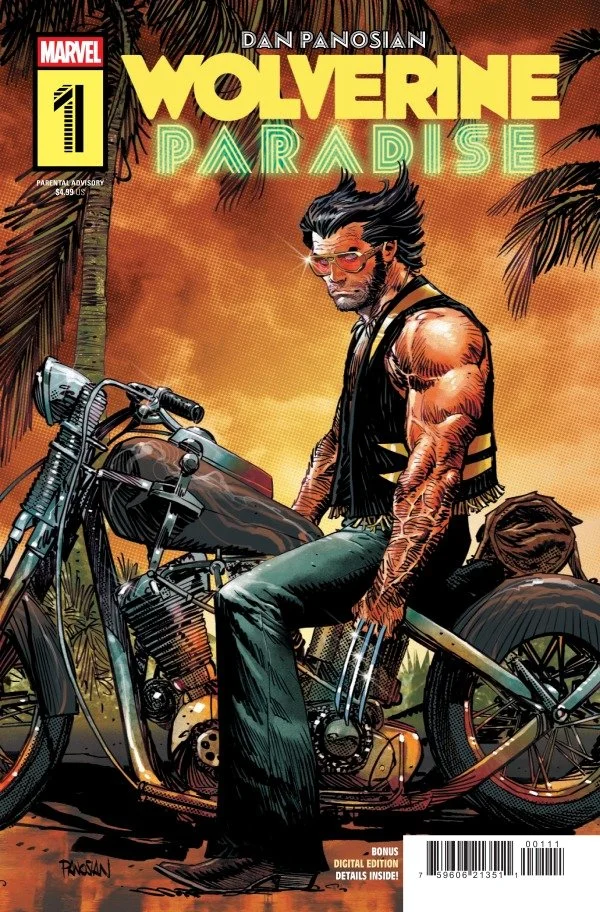
Wolverine is tired of being a hero, especially after Jean Grey passes away. So, he quits the X-Men and does what anyone in the early 80’s would do…he goes to Miami. But once there it appears that trouble manages to find him. Dazzler finds Logan on the beach and asks for his help, as she is in trouble with some local mobsters. Will Wolvie give her a hand or should I say claw?
Wolverine: Paradise #1 – Writing, Art, and Colors By Dan Panosian - Letters By Corey Petit - Edited By Mark Basso - Published By Marvel Comics
Credit: Marvel Comics
*** POSSIBLE SPOILER WARNING ***
WRITING:
This first issue does an effective job of establishing the backstory, Logan’s emotional state, and the central conflicts that will drive the series forward. Dan Panosian gives readers a clear sense of what is happening inside Logan’s head as he walks away from the X-Men, framing the decision less as a dramatic rejection of his teammates and more as the response of a man who has reached his emotional limit. The loss of Jean Grey provides a believable reason for Logan to want distance from the people, memories, and responsibilities connected to his life as a hero. His decision to escape to Miami is equally convincing. In the early 1980s, the city’s sun-soaked beaches, nightlife, excess, and constant movement make it feel like the last place anyone would expect to find a grieving former X-Man trying to disappear. That setting also gives Panosian a great deal of room to explore crime, celebrity, temptation, and the darker side of paradise. At the same time, the mysterious figure following Wolverine to Miami adds a steady undercurrent of suspense. Panosian reveals just enough to keep readers questioning the character’s identity and purpose, then delivers a satisfying reveal at the end of the issue. The payoff works on its own while also creating a strong hook for the larger story, suggesting that Logan’s attempt to leave his old life behind may have brought him directly into another dangerous situation.
The most entertaining choice Panosian makes is bringing Dazzler into the story. Under different circumstances, her appearance might feel unexpected, but an early-1980s Miami setting makes her a natural fit. Dazzler’s connection to music, performance, celebrity, and nightlife allows her to belong in a world of crowded discos, neon-lit clubs, glamorous appearances, and danger hidden beneath the city’s colorful surface. Her presence also creates an appealing contrast with Logan. She is associated with spectacle and attention, while he has come to Miami hoping to avoid both. Putting them together gives the issue an energetic odd-couple dynamic and immediately tests whether Logan can truly stop being a hero when someone asks for his help. The setting strengthens that conflict. Panosian presents Miami as a place of beaches, discos, indulgence, and debauchery, but also as a city where organized crime can thrive behind the image of paradise. That makes Hammerhead a smart choice for the villain. He is a deep cut from Marvel’s criminal underworld, yet his old-fashioned gangster identity fits naturally into a story influenced by the era of the Cocaine Cowboys in South Florida. His involvement gives the plot a grounded criminal threat that can stand alongside the comic’s more colorful personalities. By the end of the first issue, Panosian has introduced several seemingly wild ingredients Wolverine in retirement, Dazzler in trouble, a mysterious pursuer, and Hammerhead operating in Miami, but they complement one another surprisingly well. The debut is deliberately over-the-top, yet each choice supports the time period and setting, leaving the series with considerable promise and several compelling directions to explore.
ARTWORK:
The artwork in this first issue brings the early 1980s to life with a strong sense of place, fashion, and atmosphere. Dan Panosian fills the pages with recognizable imagery from the era, allowing readers to understand immediately when and where the story takes place without relying on lengthy exposition. The Miami beach scenes capture the city’s sun-soaked appeal through open spaces, casual crowds, and a relaxed surface that contrasts with the danger following Logan. The nightclub sequences shift into a denser and more chaotic visual register, using packed interiors, period clothing, dramatic lighting, and an atmosphere of excess to evoke Miami nightlife at its most colorful and unpredictable. Panosian’s character designs are equally effective. Wolverine looks as though he stepped out of The Warriors, with a rough street-level style that emphasizes his physical presence and outsider status rather than presenting him as a polished superhero. Dazzler, by contrast, fully embraces the heightened glamour of the period. Her fashion, hair, and performance-ready appearance fit naturally within the flashy, drug-fueled club scene while still making her instantly recognizable. Even Hammerhead receives a memorable design. His sharp gangster look reflects the character’s traditional criminal identity while also matching the story’s Miami underworld aesthetic. Each design communicates personality at a glance, and together they make the cast feel like natural inhabitants of this exaggerated but convincing version of the early 1980s.
Panosian’s color work reinforces the period setting just as strongly as the line art. The palette draws on the vivid visual language associated with the early 1980s, balancing warm beach tones and sun-faded surfaces with the more electric colors of Miami’s nightlife. Bright accents give the clubs energy and spectacle, while the aged treatment applied to many backgrounds prevents the comic from looking too clean or contemporary. That weathered texture gives the pages the character of an older printed artifact, as though the story has been pulled directly from the era it depicts. The use of Ben-Day dots is especially effective because it does more than imitate vintage comic book production. The pattern adds visible texture, softens selected colors, and creates a deliberate retro quality that complements the clothing, locations, and character designs. Rather than allowing the period effects to overwhelm the storytelling, Panosian uses them consistently enough to establish an identity for the book while keeping figures, action, and environments easy to follow. Cory Petit’s lettering supports that same balance. The captions, dialogue, and sound effects have a subtle throwback quality that belongs beside Panosian’s artwork, yet the presentation remains clean, legible, and well organized across the page. Petit guides the reader smoothly through conversations and action without distracting from the visual details. Together, Panosian and Petit make the comic feel authentically connected to the early 1980s while refining the presentation for a modern audience. The result has the texture and personality of a period piece without sacrificing clarity, pacing, or accessibility.
Check Out OUR NYCC 2026 COVERAGE
Final Thoughts:
Wolverine: Paradise #1 is a stylish and entertaining debut that combines Logan’s grief with the vibrant excess and criminal underworld of 1980s Miami. Dan Panosian’s confident writing and distinctive artwork make this an exciting start with plenty of promise for issue two. Grab a copy of this issue when you’re at the LCS this week and enjoy the wonderful nostalgia and fun story. I’m sure after you read issue one, you will be hooked for at least issue two, if not the whole series.
FINAL GRADE: 9/10
Let me know your thoughts on Wolverine: Paradise #1 in the comments below. Thanks for reading!