It’s 1948 and there is an art heist at the Art Museum in New York City. But this heist is a little different as the robbers got into a car accident while fleeing and the artwork that was stolen got burnt up. However, it is believed that there is more to this story and that it may have been an inside job. The director of the Art Museum hires Rip Kirby, a former member of the special forces turned private detective to investigate. Rip alongside his butler Desmond, and his main squeeze Dorian, are on the case and they will leave no stone unturned. But this case turns out to be a lot more than what any of them bargained for.
Rip Kirby #1 – Written By Christopher Sebela – Art By Tango – Colors By Kike “K.J.” Diaz – Letters By Jeff Eckleberry - Edited By Sarah Brunstad - Published By Mad Cave Studios
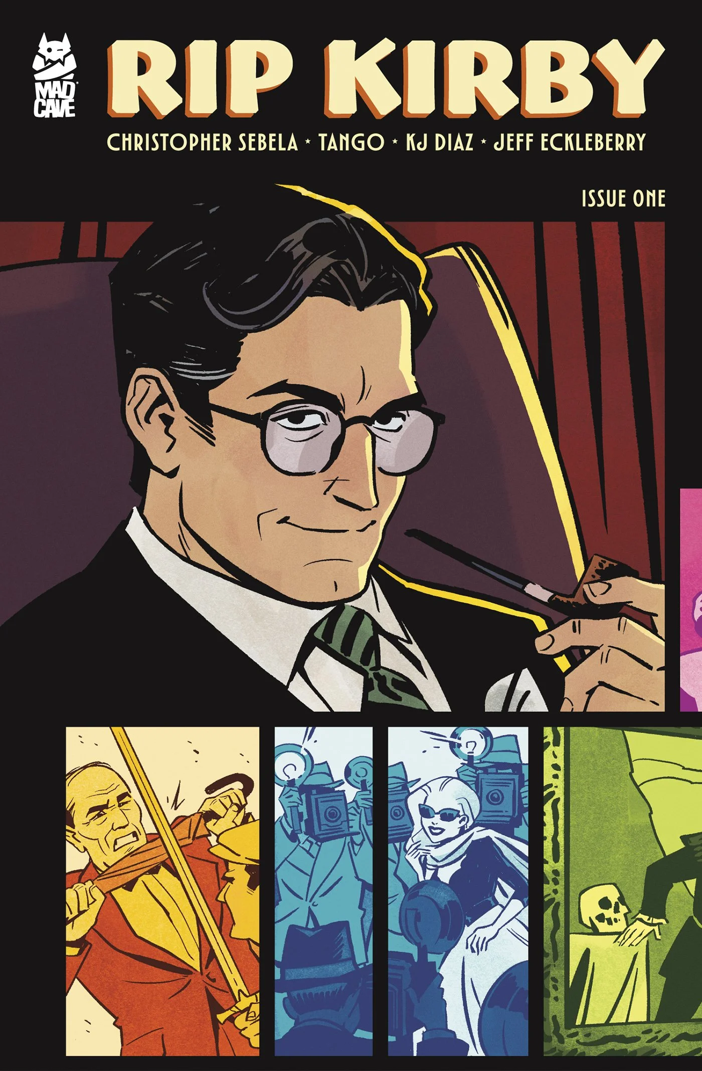
Credit: Mad Cave Studios
*** POSSIBLE SPOILER WARNING ***
WRITING:
This first issue does an amazing job of setting up this world, the characters, and the art heist mystery. Christopher Sebela does a great job of introducing us to this world and series. The character development makes us care for the characters, as well as establishes all of their roles. Rip is a complex main character that the more we learn about him the more we realize that the bad guys may have bitten off more than they can chew. As the mystery of the heist unfolds, we get to have a front row seat to Rip’s techniques and style as an investigator. With excitement around every corner, you never know if Rip or his team will be in danger, or if we should worry about the safety of the criminals. By the end of the issue, we learn of the mastermind behind the heist, and this creates a great threat for the series to follow. Sebela really captures the crime noir that is playing out on the pages and makes you want to read more ASAP.
ARTWORK:
The artwork in this first issue captures the crime noir vibes impeccably. Tango immerses the reader in the 1940’s era and makes the artwork look like a cartoon strip of the time. With the linework established in the era of the story, it makes it more believable that the heroes and villains are from this time. The character designs match the style of the era, well also staying true to the time period. There is a distinction between the good guys and the bad guys and makes this feel even more on brand with similar stories that take place in this era. The color choices by K.J. Diaz give the art a modern feel without overpowering the aesthetic of the story. The more vibrant colors are appealing to the readers’ eyes and help make the artwork more noticeable. Jeff Eckleberry’s letters are clear and concise, well blending into the scenes they are a part of. The action words are really cool and further the look and feel of the story.
CHECK OUT MY REVIEW OF the last starfighter #3
Final Thoughts:
Rip Kirby #1 kicks off an intriguing crime noir mystery with compelling characters, an art heist that raises plenty of questions, and a detective whose methods are as exciting as the case itself. Christopher Sebela gives readers plenty of reasons to return, while Tango’s period-inspired artwork, K.J. Diaz’s vibrant colors, and Jeff Eckleberry’s expressive lettering bring this world to life. With a mastermind revealed and more danger ahead, this first issue leaves me eager to see where Rip and his team go next. If you enjoy stylish detective stories with mystery and action, pick up a copy of Rip Kirby #1 and join the investigation!
FINAL GRADE: 9/10
Let me know your thoughts on Rip Kirby #1 in the comments below. Thanks for reading!