THE PATRON #2 (IGNITION PRESS)
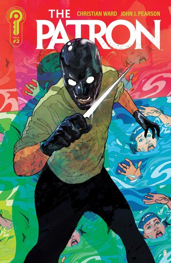
This thriller set in the world of art is starting to heat up and take more shape. As Mr. Cherish’s evil ways continue to be successful, they hit their first bumps in the road. As now a detective from Portland, Oregon is starting to put together that there may be a connection with these deaths in the art world. At the same time, it seems like a ghost is taunting Cherish and driving him a little bit insane.
The Patron #2 – Written By Christian Ward – Art By John J. Pearson – Letters By Hassan Otsmane-Elhaou - Edited By Maggie Howell - Published By Ignition Press
Credit: Ignition Press
*** POSSIBLE SPOILER WARNING ***
STORY OVERVIEW:
Detective Tabitha Stone of the Portland Police Department can’t help but notice a pattern to the deaths in the art world. Seeing that they may be connected and possibly of a nefarious nature, she starts to bother her Captain along with her lover Emma. But even Emma has to admit that she may be on to something. Meanwhile, Luce knows that her boyfriend Matthew Barnes death was no accidental overdose and she has her sights set on the man she knows is responsible, Mr. Cherish. However, the more she delves into Matt’s life and art, the more questions it brings up with her. Well all of this is happening, Mr. Cherish is starting to get freaked out about the mysterious paintings by Matt Barnes that keep showing up wherever he is at. How is a dead man sending him new paintings? He needs his lover and his killer to get to the bottom of this and fast.
WRITING:
This issue significantly intensifies the thriller elements of the series while revealing just enough new information to deepen the central mystery. Christian Ward continues to layer multiple storylines, character motivations, and unanswered questions in a way that keeps the narrative moving without making it feel overcrowded. Each plot thread advances independently, yet they all circle back to Mr. Cherish and the consequences of the crimes he believed he had successfully concealed. The result is an issue that feels larger in scope than the opening issue while also becoming more personal and psychologically unsettling.
The introduction of Detective Tabitha Stone is an especially important development because it brings an official investigation into a story that has previously been driven largely by private grief, ambition, and revenge. Stone recognizes that the deaths surrounding the art world may not be isolated incidents, even when the people closest to her initially treat her suspicions as excessive. Her determination gives the story a procedural dimension and establishes that Cherish’s carefully constructed crimes are beginning to leave a detectable pattern. For the first time, there is a believable force capable of exposing him through evidence rather than intuition or vengeance alone.
Stone’s focus also changes the tension surrounding Cherish. The question is no longer simply whether he will be caught, but how much time he has before the pieces fall into place. That distinction creates a looming deadline even though none of the characters yet understands the full scope of the danger. Ward uses dramatic irony effectively: readers can see several people moving toward the same truth while remaining unaware of one another. This gives even quiet conversations and investigative scenes a sense of momentum because every discovery narrows the distance between Cherish and exposure.
Cherish’s own storyline becomes more compelling as his confidence begins to crack. He has operated with the certainty of someone who believes wealth, influence, and violence can solve any problem, but the unexplained appearance of new paintings by the dead artist Matthew Barnes attacks that certainty at its foundation. The paintings are not merely threatening objects; they are reminders of a crime Cherish thought had been erased. Because he cannot determine who created them, how they are reaching him, or what they reveal, he is forced into a reactive position for the first time. His growing agitation makes him more unpredictable and suggests that fear may eventually become as dangerous to him as the investigation itself.
The mystery of the paintings adds both a classic whodunit component and the possibility of something supernatural. Ward leaves enough ambiguity for several explanations to remain plausible. Someone may be using Matt’s work to torment Cherish, Luce may know more than she has revealed, or the paintings may point toward an element beyond ordinary manipulation. That uncertainty works because it reflects Cherish’s own lack of control. Readers are encouraged to examine every new appearance for clues while also questioning whether the apparent answer is too obvious.
Luce’s arc provides the emotional center of the issue. Her grief over Matt’s death is not passive; it fuels her need to uncover the truth and hold someone accountable. At the same time, her investigation forces her to confront the possibility that the man she loved had a private life, hidden intentions, or unfinished work she never understood. Ward uses those discoveries to complicate both Matt’s character and Luce’s memories of him. Her search is therefore about more than identifying a killer. It is also about deciding how much of their relationship was real and whether knowing the complete truth will bring closure or deepen her loss.
This emotional uncertainty makes Luce especially engaging because she is pursuing answers that may hurt her. She wants justice, but every clue challenges what she believed about Matt and the events leading to his death. The reader shares that instability. Information that initially seems to clarify the mystery often creates another question, encouraging us to reconsider assumptions about the characters and their roles. Even the possibility that Luce is responsible for the paintings remains deliberately unresolved. She appears to be the most likely candidate on the surface, but Ward avoids confirming it, preserving room for a reveal that could reshape the entire conflict.
The issue’s strongest suspense comes from the converging pursuit of Luce. Cherish’s killer and Detective Stone are both moving toward her for very different reasons, yet neither knows that the other is involved. Luce herself may not understand how exposed she has become. Readers, however, can see the separate paths drawing closer, which creates urgency before any direct confrontation occurs. This structure turns the storyline into a race in which only the audience knows all the competitors are running. Every delay, discovery, and wrong assumption matters because it may determine who reaches Luce first and what happens when they do.
Ward balances these threads with strong pacing, shifting between investigation, grief, paranoia, and menace without allowing one element to overwhelm the others. The issue answers enough questions to provide forward movement, but its new revelations consistently open larger mysteries. By the final page, the tension built across all three central arcs pays off in an image designed to shock the reader and immediately raise the stakes. It is the kind of ending that does more than tease the next installment; it changes the reader’s understanding of what may be possible in this story and makes the wait for the next issue feel much longer.
ARTWORK:
The artwork in this issue is stunning, unsettling, and beautiful all at once. John J. Pearson delivers a masterclass in visual storytelling, creating pages that feel less like conventional comic book illustrations and more like carefully composed paintings. That approach is especially appropriate for a story rooted so deeply in the art world. Rather than allowing the subject matter to exist only in the dialogue and plot, Pearson makes the artwork itself part of the story’s identity. Every page reinforces the idea that beauty and horror can occupy the same space, giving the issue a distinctive visual character that is both elegant and deeply unnerving.
Pearson’s painting style creates an eerie atmosphere that perfectly mirrors the mystery unfolding around the characters. Shapes, shadows, and textures often seem to bleed into one another, giving the environments a dreamlike quality without sacrificing narrative clarity. Even ordinary rooms and conversations carry a quiet sense of danger because the compositions rarely allow the reader to feel completely comfortable. Backgrounds can appear oppressive or strangely distant, while figures are framed in ways that suggest they are being watched, trapped, or isolated. This visual uneasiness supports the story’s psychological tension and makes nearly every scene feel as though something disturbing is waiting just outside the panel.
The character work is equally impressive. Pearson communicates fear, suspicion, grief, arrogance, and desperation through subtle facial expressions and body language rather than relying on exaggerated reactions. Readers can immediately understand what a character appears to be feeling, yet there is often enough restraint to leave that character’s true intentions uncertain. A glance may suggest recognition without confirming it, while a rigid posture or half-hidden expression can imply anxiety, guilt, or calculation. That ambiguity is essential to a thriller built around secrets. The characters reveal enough to keep the emotional stakes clear, but never so much that the mystery loses its power.
Pearson’s compositions also control the pacing of the issue with precision. Wider panels give important locations and ominous discoveries room to breathe, while tighter close-ups draw attention to small reactions that might otherwise be missed. The movement from one image to the next feels deliberate, guiding the reader’s eye toward clues, expressions, and threatening details without making that guidance obvious. Quiet scenes are allowed to linger, building tension through stillness, while sudden shifts in framing make moments of danger feel immediate. The layouts therefore do more than present the story clearly; they determine when the reader should pause, when suspicion should grow, and when the full impact of a reveal should land.
The color palette is another major reason the issue feels so distinctive. Pearson relies heavily on darker earth tones, muted browns, deep reds, sickly greens, and heavy shadows, giving the pages an almost macabre quality. These colors make the world feel aged, stained, and morally compromised, as if Cherish’s corruption has seeped into the spaces around him. Brighter colors become more powerful because they are used selectively, often drawing attention to a painting, a face, or a moment of sudden danger. The contrast between subdued backgrounds and sharper bursts of color gives key images an almost unnatural intensity and helps the mysterious artwork feel separate from the ordinary world.
The violent sequences stand out from the surrounding material without feeling disconnected from Pearson’s broader aesthetic. The brutality is direct enough to establish real danger, but it is presented with the same attention to composition, texture, and color as the quieter scenes. This prevents the violence from becoming empty spectacle. Instead, each disturbing image reveals something about the people committing these acts and the world that permits them to operate. The physical consequences feel severe, while the controlled visual presentation makes the villains appear even more depraved. Their cruelty is not chaotic or accidental; it is purposeful, intimate, and frighteningly calculated.
Pearson is particularly effective when depicting the mysterious paintings connected to Matthew Barnes. They function as clues, threats, memories, and possible supernatural intrusions all at once. Their presence changes the mood of each scene because the reader understands that they carry meaning beyond their surface appearance. By rendering them with a visual energy that feels familiar yet somehow separate from the surrounding reality, Pearson makes it easy to understand why Cherish is so disturbed by them. They seem to accuse him without speaking, turning art into a weapon against a man who believes he can possess, control, and destroy anything he wants.
Hassan Otsmane-Elhaou’s lettering complements Pearson’s artwork by keeping the dialogue readable without interrupting the visual flow. The placement of balloons and captions helps guide the eye naturally across the page, while the lettering allows intense exchanges to retain their rhythm and personality. In an issue with dense atmosphere and highly textured imagery, that clarity is important. The words feel integrated into the compositions rather than placed on top of them, allowing the writing and artwork to work together as a single storytelling system.
Overall, the artwork does far more than illustrate what is happening. It establishes the issue’s emotional temperature, controls its suspense, deepens the mystery, and reveals character information that the dialogue deliberately withholds. Pearson’s painting technique transforms the artworld setting into an essential visual language for the entire series. Beauty draws the reader into each page, while the shadows, restrained expressions, unsettling colors, and sudden violence keep that beauty from ever feeling safe. The result is artwork that moves the themes and story forward with remarkable precision, making the issue more immersive, more disturbing, and more memorable.
Check Out KEN’S REVIEW OF THE PATRON #1
Final Thoughts:
The Patron #2 builds confidently on its opening issue, deepening the mystery while tightening the pressure around Cherish, Luce, and Detective Stone. Christian Ward’s layered suspense and John J. Pearson’s haunting, painted artwork makes this a stylish and unsettling thriller that continues to gain momentum. With its gripping final reveal, this is an issue worth adding to your collection for sure. This book is my Pick of the Week and should be a must get when you visit your LCS this week. Furthermore, if this series isn’t on your Pull List, you need to rectify that immediately.
FINAL GRADE: 10/10
Let me know your thoughts on The Patron #2 in the comments below. Thanks for reading!