MIDNIGHT X-MEN #1 (MARVEL COMICS)
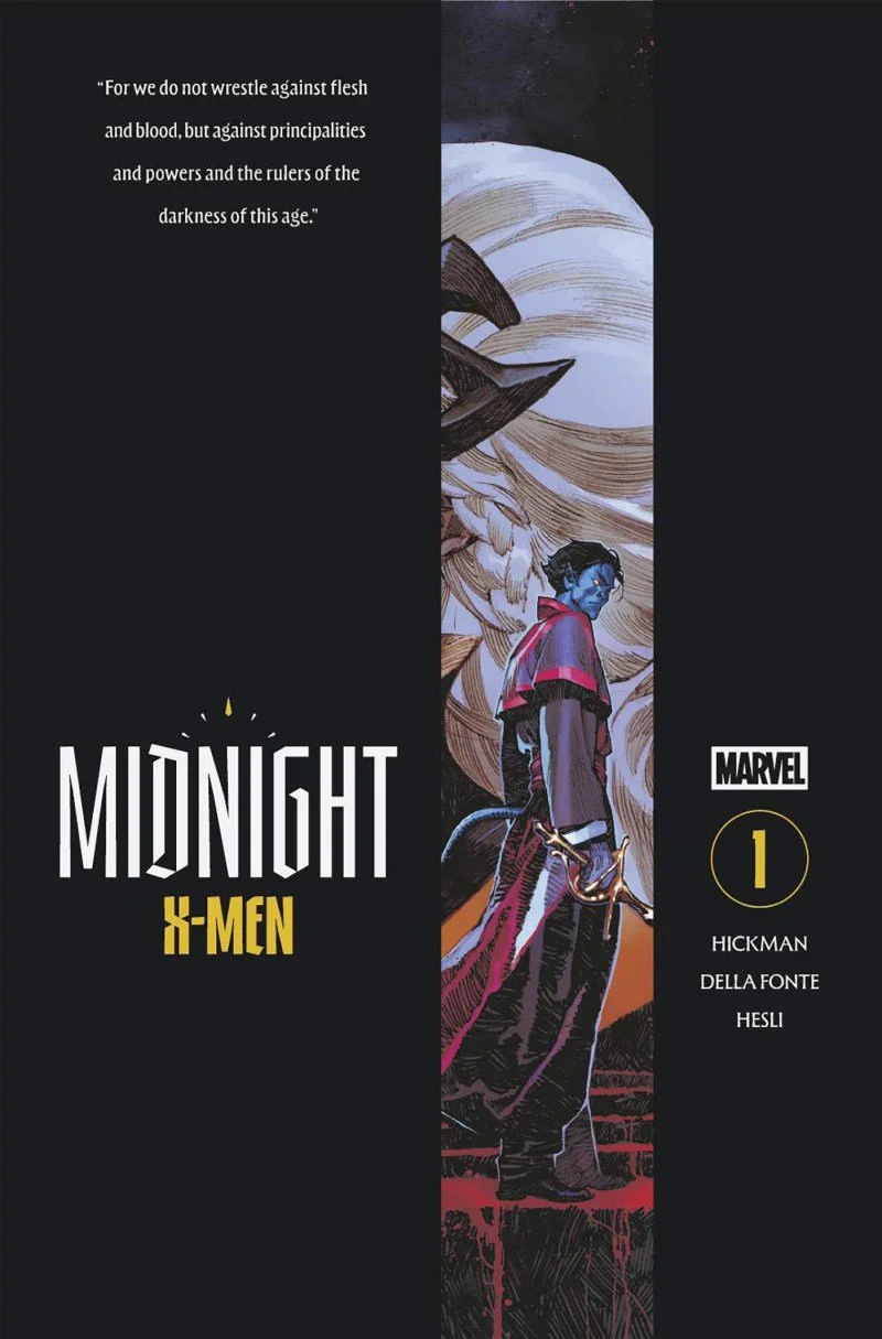
The world is caught between a new kind of war. One where humans no longer need to just fear mutants, but also other humans so to speak. Vampires have invaded the world, but unfortunately for them they infected some very powerful mutants. This led to war between the two different species of vampires, the human ones and the mutant ones known as empyres. But now Cardinal Stryker has ordered his holy troops to kill off the empyres, which will surely cause a three-way war. Bishop Wagner and the last X-Man are all that can stand in the way and possibly save the day.
Midnight X-Men #1 – Written By Jonathan Hickman – Art By Matteo Della Fonte – Colors By Arthur Hesli – Letters By VC’s Cory Petit – Edited By Jordan D. White - Published By Marvel Comics
Credit: Marvel Comics
*** POSSIBLE SPOILER WARNING ***
WRITING:
This first issue introduces a strange, unsettling world that exists inside a version of the X-Men universe readers already recognize. Jonathan Hickman constructs this horror-infused setting in a way that deliberately mirrors the familiar mutant status quo, giving the story recognizable institutions, conflicts, and personalities while twisting them into darker forms. That balance allows the issue to feel immediately accessible without sacrificing its own identity. Cardinal Stryker is one of the clearest examples: transforming a known enemy of mutantkind into a religious leader preserves the character’s established fanaticism while adapting it to a world shaped by vampires, infected mutants, and holy warfare. Similar parallels appear throughout the issue, encouraging readers to compare this reality with the traditional X-Men universe and consider how familiar relationships and rivalries have changed. These recognizable elements provide an important foundation for the story. They make the setting easier to understand, create curiosity about what else may be different, and help readers accept the issue’s more unusual ideas. By grounding an original horror concept in the themes and conflicts that have long defined the X-Men, Hickman creates a world that feels both comfortably familiar and dangerously unpredictable.
The story deepens that sense of unease by taking some of the most recognizable X-Men and transforming them into monsters. Fan favorites such as Gambit, Storm, and Psylocke are no longer simply heroes fighting an outside threat; they have been infected by it, forcing readers to question how much of their former selves remains. This premise gives Hickman room to blur the usual lines between hero and villain, mutant and vampire, victim and predator. Every familiar face carries the possibility of hidden motives or divided loyalties, making the world feel unstable even when the characters themselves are recognizable. The relationship between Nightcrawler and Storm is especially effective because it gives this larger conflict a more personal emotional center. Their connection through shared loss adds tenderness to the horror and suggests that affection, memory, and grief continue to shape them despite what they have become. At the same time, that bond complicates Kurt’s position and raises questions about whether his loyalty belongs with his former teammates, the infected mutants, or his own moral convictions. The introduction of the last X-Man is more predictable, since the identity is the obvious choice, but it is also dramatically satisfying. Hickman uses that familiarity to deliver a strong climactic confrontation, giving the issue an action-heavy payoff while establishing a central figure readers can follow deeper into this fractured world.
The issue’s biggest weakness is that Hickman drops readers into this altered world with very little guidance. The lack of immediate explanation is clearly intended to create mystery, and there is some enjoyment in recognizing familiar characters and gradually piecing together what has happened to them. However, the story often withholds so much context that intrigue begins to turn into confusion. The distinctions among human vampires, infected mutants, the empyres, and Cardinal Stryker’s forces are introduced quickly, but their histories, goals, and relationships are not always clearly defined. As a result, readers must spend much of the issue trying to determine the basic rules of the setting rather than fully engaging with the character drama or immediate danger. This uncertainty also affects the pacing. Scenes that should build urgency can feel slower because the reader is still sorting through terminology, allegiances, and unexplained references. A few additional lines of exposition, a more focused opening sequence, or a clearer point-of-view character could have provided necessary orientation without eliminating the mystery. The complexity may reward a second reading, but on the first pass it makes the issue feel denser and more perplexing than it needs to be, weakening some of the momentum created by the premise and climactic action.
ARTWORK:
The artwork in this first issue has a striking sense of realism that gives the story a convincing gothic beauty. Matteo Della Fonte renders faces, costumes, and environments with enough detail to make this supernatural world feel tangible, while still emphasizing the dramatic qualities expected from an X-Men story. His reinterpretations of familiar characters are especially effective because they retain recognizable features without simply repeating their traditional designs. Readers can identify figures such as Nightcrawler, Storm, and the other transformed mutants, yet their altered clothing, posture, and physical details immediately suggest that they belong to a darker and more dangerous reality. The character designs also provide important clues about alliances and internal conflict. Bishop Wagner may dress and carry himself like a holy warrior serving Cardinal Stryker, but subtle changes in his expression and body language reveal that Nightcrawler is not completely comfortable with the orders he has been given. Hesitation in his stance, tension in his face, and the way he responds to the other characters communicate uncertainty before the dialogue fully explains it. Della Fonte uses similar visual choices throughout the issue, allowing glances, gestures, and physical distance between characters to reveal fear, loyalty, suspicion, and grief. These strong characterizations are essential because the story introduces a complicated world very quickly. Even when the plot offers limited explanation, the artwork helps readers understand who holds power, who may be hiding something, and which relationships carry emotional weight. A significant amount of storytelling is therefore accomplished through facial expressions and body language, making the characters feel more layered and keeping the issue emotionally readable amid its dense mythology.
The scale of the world and the variety of locations are another major reason the artwork succeeds. Della Fonte frequently places the characters within grand, imposing environments that make them appear small in comparison with the forces surrounding them. Vast interiors, monumental structures, crowded battle spaces, and expansive exterior views give the impression that this conflict stretches far beyond a single group of heroes. These large set pieces do more than provide spectacle; they help establish the power of the factions competing for control and reinforce the idea that the war among human vampires, mutant empyres, and Cardinal Stryker’s troops has reshaped the entire world. The environments also strengthen the gothic tone through dramatic architecture, deep spaces, and locations that feel ancient, ceremonial, or threatening. When the action begins, the composition becomes more energetic without losing clarity. Characters move through the panels with a strong sense of direction, and the changing viewpoints make attacks, chases, and confrontations feel fast and unpredictable. Wider images emphasize the massive scope of the conflict, while closer panels return attention to individual reactions and physical danger. This contrast prevents the spectacle from overwhelming the characters. The result is a world that feels enormous, active, and hazardous at every level. Even lighter moments or brief pieces of visual humor occur against settings that remind the reader how unstable the situation is, allowing the issue to remain entertaining while maintaining a constant sense of danger.
Arthur Hesli’s colors give the artwork additional depth and help unify the issue’s realism with its supernatural atmosphere. Rather than relying only on exaggerated horror colors, Hesli uses a palette that allows skin, clothing, stone, metal, and architectural details to retain a believable texture. This naturalism makes the characters and locations resemble real people and recognizable landmarks, grounding the story even when the plot introduces vampires, infected mutants, and religious armies. At the same time, the palette shifts when the mood or danger changes. Darker shadows and muted tones create a heavy gothic atmosphere, while sharper highlights and more intense colors draw attention to violence, supernatural power, or an important emotional reaction. These contrasts guide the reader’s eye through the panels and help separate characters from complex backgrounds without making the images feel artificial. The coloring also supports the story’s different factions by giving their scenes distinct visual identities, making it easier to sense when the narrative moves between sacred spaces, hostile territory, and moments of personal conflict. Light is especially important: it can make a location feel solemn and cathedral-like in one scene, then harsh and threatening in the next. Hesli’s work therefore does more than make the pages visually attractive. It strengthens the atmosphere, clarifies the action, and makes this alternate X-Men world feel physically believable. By grounding the fantastic elements in convincing color and light, the issue’s horror becomes more immediate because it appears to be unfolding in a world that could genuinely exist.
Check Out KEN’S REVIEW OF UNCANNY X-MEN #36
Final Thoughts:
Midnight X-Men #1 is an ambitious, visually striking debut that gives the X-Men a compelling gothic-horror makeover. Jonathan Hickman’s dense world-building can be confusing at first, but the intriguing character dynamics, large-scale conflict, and atmospheric artwork from Matteo Della Fonte and Arthur Hesli make this alternate reality worth exploring. It is a strong opening issue with enough mystery and momentum to bring readers back for the next issue.
FINAL GRADE: 8/10
Let me know your thoughts on Midnight X-Men #1 in the comments below. Thanks for reading!