
KNIGHT CITY #1 (DARK HORSE COMICS)
The Knight is a superhero that is all powerful and is relied upon to keep the world safe. However, he has a hard time sleeping, but when he does, he feels like he’s in a different world. Or is it that he is a guy named Carl and the Knight is the dream world?
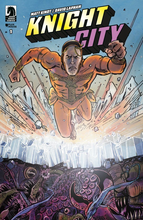
Knight City #1 – Written & Colors By Matt Kindt – Art By David Lapham – Color Assists By Sophia Hilmes - Letters By Josh Reed - Edited By Daniel Chabon - Published By Dark Horse Comics
Credit: Dark Horse Comics
*** POSSIBLE SPOILER WARNING ***
STORY OVERVIEW:
The Knight is in an epic battle with his arch nemesis Zero, but this time he is so tired. As the fight reaches its conclusion Knight’s tiredness causes him to nearly kill Zero. Thankfully he refrained from crossing that line and stayed the beacon of truth. He then visits his love Laney, and they have an odd interaction, but chalk that up to being tired. As he returns to his fortress in Antarctica, he tries to tune the noise out and get some sleep.
Just then Carl wakes up in his modest apartment and is late for work. His boss at the financial firm Laney chastises him for being late. As he goes along with his mundane day, he can’t shake the dream he had of being a superhero. At one point he cut his finger on a broken coffee pot, which makes him bandage it. Alone finally again in his apartment he passes out on his couch. At that point the Knight wakes up in his therapist’s office, but the cut is still on his finger.
WRITING:
This first issue enters the reader into this strange world where you don’t know what is real or a dream. Matt Kindt does an incredible job of blurring the lines of what is truly reality and what is a dream. Kindt doesn’t let on to which reality is real, or better yet if both are actually real and this really hooks you as the reader. The story has a familiarity due to the similarities of the Knight and Superman, but the reality twist really makes it a unique story. As the issue goes on more questions are raised than are answered. These mysteries really build up some suspense and hook the reader further.
ARTWORK:
As original as the story is, the artwork is equally unique. David Lapham brings this weird world to life with his unique art. Even better, Lapham uses slightly different art styles in the two different realities, separating them further and keeping the reader guessing what is real. To add to the complete mind bender that this story is, Josh Reed’s lettering changes in each of the realities to further drive home the divide. Although this sounds confusing, it actually makes the realities easier to navigate.
Check Out My Review of Masterminds #3
Final Thoughts:
Knight City #1 is a breath of fresh air with its unique story style. The fact that the reader can’t quite figure out what is real makes this book intriguing. Both realities bring a sense of realism that continues to make the reader guess. I know this all sounds confusing, but it is confusing in the best, most enjoyable way. Don’t believe me? Grab a copy at the shop this week and prepare for the craziest ride of the week, and I promise you won’t be disappointed.
FINAL GRADE: 9.5/10
Let me know your thoughts on Knight City #1 in the comments below. Thanks for reading!